Have you ever walked into a room and instantly felt your shoulders drop and your body relax? Or maybe you stepped into a sunroom that immediately made you feel awake and conversational. Paint does that. It works on your nervous system long before your conscious mind notices the throw pillows or furniture.
Light wavelengths trigger biological and emotional reactions that alter your heart rate and energy levels.¹ When you pick up a paintbrush, you aren't just choosing a shade for your drywall. You're setting the daily mood for everyone who steps inside.
So how do you balance your personal style with what color psychology suggests? Start by looking at what actually happens in the room. Social hubs like living rooms, entryways, and dining spaces thrive on warm, inviting tones. Soft terracottas, warm ochres, and deep chocolate browns evoke physical warmth and hospitality. According to color experts, warm shades like reds and cinnamon tones stimulate appetite and social energy, making them great picks for dynamic gathering spaces.²
Bedrooms and home offices require the opposite approach. Muted slate blues, soft sage greens, and heathered plums activate your body's parasympathetic nervous system. Cool greens reduce eye strain during long work hours, while soft blue shades promote mental quiet and stress recovery. Save the intense primary colors for small accents and let your primary walls do the heavy lifting for your mental peace.
Mastering the Light and Matching Paint Tones to Room Lighting
Have you ever picked a cozy, warm beige at the store, only to slap it on your wall and realize it looks like greenish mud? You're not alone. Light is the single biggest factor in how paint registers in a home. The same can of paint will look entirely different depending on the window direction and the light bulbs.
Natural light changes based on where your windows face
• North-Facing Rooms: These spaces receive cool, indirect light with a soft blue cast all day. Cool grays and slate blues can look chilly or dingy here. To balance the room, pick paints with warm yellow, peach, or soft pink undertones.
• South-Facing Rooms: South light brings intense, golden sunshine from morning to night. It improves both warm and cool shades, though delicate pastels can get washed out. Crisp blues, cool grays, and soft greens work beautifully to temper the natural heat.
• East-Facing Rooms: You get warm golden light at sunrise, which turns into cooler shadows by late afternoon. Adaptable transitional neutrals or soft sage greens handle this shift smoothly without crashing.
• West-Facing Rooms: Shadows dominate the morning, but late afternoons bring a fiery orange glow. Cool off-whites and muted green-grays prevent late-day light overload.
Don't forget artificial light! Color temperature is measured on the Kelvin scale, and your light bulbs can completely rewrite your paint choice. Standard 2700K warm bulbs emit a golden glow that enriches warm earth tones, but they will turn crisp blue-grays greenish. Daylight bulbs at 5000K cast a heavy blue bias that can make your living space feel clinical.
Aim for 3500K to 4000K bulbs. That is the sweet spot for clean, true color representation across every room.
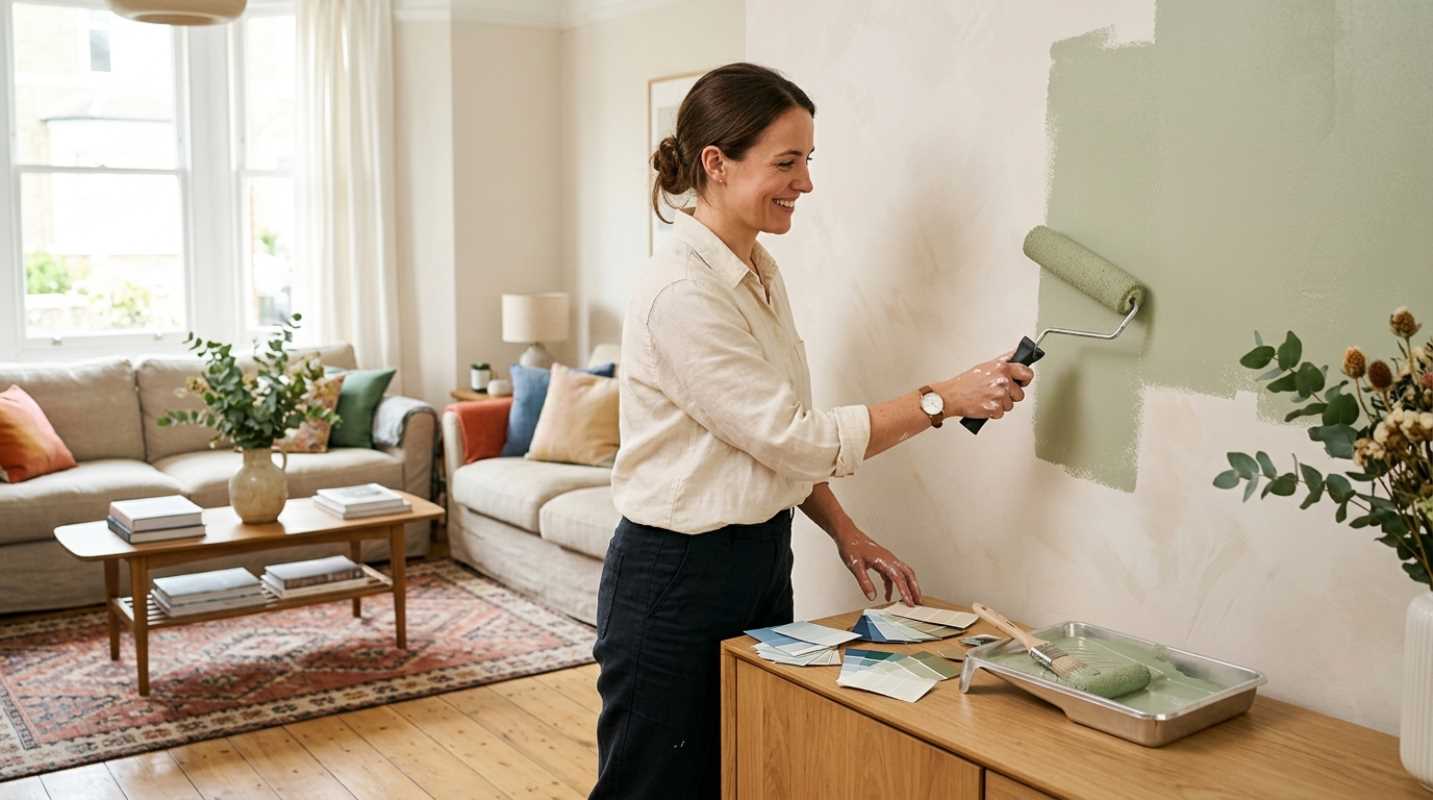
Pro tip: Never commit to a color based on a tiny paper swatch under hardware store fluorescent lights. Buy peel-and-stick samples, place them on multiple walls, and watch them change at morning, noon, and night.
Embracing Warm Interior Paint Trends
Cold, sterile grays have officially left the building. Today's color trends favor grounding, rich hues that create a cocooning sense of comfort.³
Recent paint palettes highlight deep, expressive shades
• Moody Plums and Heathered Browns: Shades like Benjamin Moore's Cinnamon Slate offer a nuanced alternative to traditional gray, introducing warmth without making a room feel dark.
• Rich Burgundy Accent Colors: Deep ruby tones, such as Behr's Rumors, bring dramatic warmth when paired with soft grounding neutrals.
• Earthy Ochres and Slate Blues: Colors like Sherwin-Williams' Bosc Pear and Rain Cloud lean into organic nature tones that feel grounded and timeless.
• Creamy Mineral Off-Whites: Bright, stark white trim is being replaced by warm, creamy off-whites that feel lived-in and welcoming.
Want to try a bold trend without replacing your paint in two years? Try color drenching. This technique involves painting the walls, baseboards, doors, and window trim in the same color. It creates an immersive look that visually expands small rooms while making dramatic colors feel intentional rather than chaotic.
If you're hesitant about going bold, try a dark shade in a small powder room or reading nook first before taking on your entire main floor.
Room-by-Room Approach for Creating a Cohesive Flow
Walking through your front door shouldn't feel like wandering through a funhouse of disconnected color schemes. You want a smooth, natural flow from room to room.
To keep visual harmony across your entire floor plan, rely on the simple 60-30-10 design rule
• 60 Percent Dominant Color: This is your main wall neutral, used across open areas, hallways, and main living zones.
• 30 Percent Secondary Color: Used for adjacent spaces, kitchen cabinetry, or accent walls to create contrast.
• 10 Percent Accent Color: Reserved for decor, painted interior doors, or architectural features that tie spaces together.
High-traffic social hubs like kitchens and living areas perform best with creamy warm whites, warm ochres, or muted terracotta shades that welcome guests. Workspaces and bedrooms benefit from muted slate blues, sage, and soft plum tones that lower your heart rate and sharpen your focus.
Final Flourishes with Finishes and Maintenance
You've found the perfect color, but you aren't done yet. The paint finish you select determines how durable, scrubbable, and active your walls will look over time. Paint finish isn't just about looks. It's about how much practical wear and tear a surface can take.
Sheen alters how light bounces off your walls
• Flat and Matte: Zero shine. Flat paint is unbeatable at hiding wall imperfections, dings, and drywall patches. It's ideal for ceilings and low-traffic bedroom walls, but it absorbs dirt and resists aggressive scrubbing.
• Eggshell and Satin: A subtle sheen with excellent durability. This is the ultimate workhorse finish for living rooms, hallways, and kids' rooms because it wipes clean easily with a damp cloth without looking slick.
• Semi-Gloss and Gloss: High reflection and superior moisture resistance. Glossy finishes are needed for baseboards, doors, architectural trim, and humid bathrooms.
A favorite designer trick is pairing flat wall paint with semi-gloss trim in the same paint hue. It creates a subtle texture contrast that looks custom and polished without adding unnecessary visual noise.
Don't let endless color cards intimidate you. Grab a few large samples, test them under your real room lighting, and trust what feels right for your space. A fresh coat of paint remains the single fastest, most affordable way to transform how your home feels every day.
Sources:
1. National Institutes of Health
https://pmc.ncbi.nlm.nih.gov/articles/PMC6120989/
2. Sherwin-Williams Color of the Year
https://www.sherwin-williams.com/en-us/color/color-of-the-year/2025
3. Postcards from the Ridge
https://postcardsfromtheridge.com/2024/09/2025-paint-color-of-the-year.html/